Portfolio: Rebranding Package
Hungry for a new name, and craving a new look.
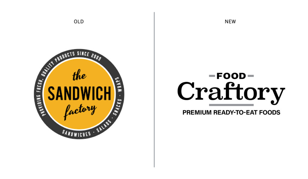
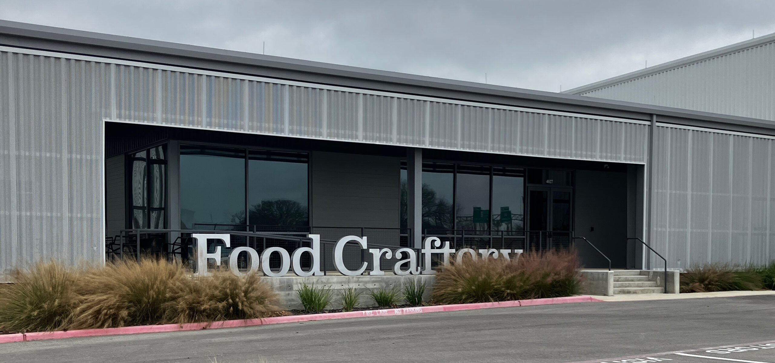
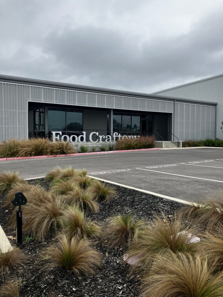
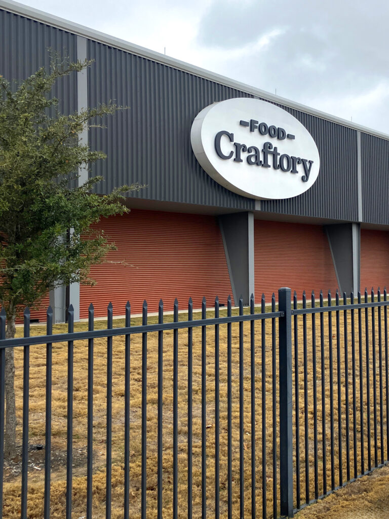
The RK Group presented me with an intriguing challenge – rebrand their Premium Ready-To-Eat-Foods division, The Sandwich Factory, with a new name and look that would reflect their bold, modern, and expanded headquarters. We took a unique approach, paying homage to their factory roots and creating a portmanteau that celebrated their culinary creations. The result? The birth of the Food Craftory.
Impressed with the transformation? Start a project like this today.
Food Craftory
Food + Art + Manufacturing
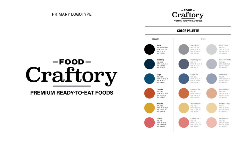
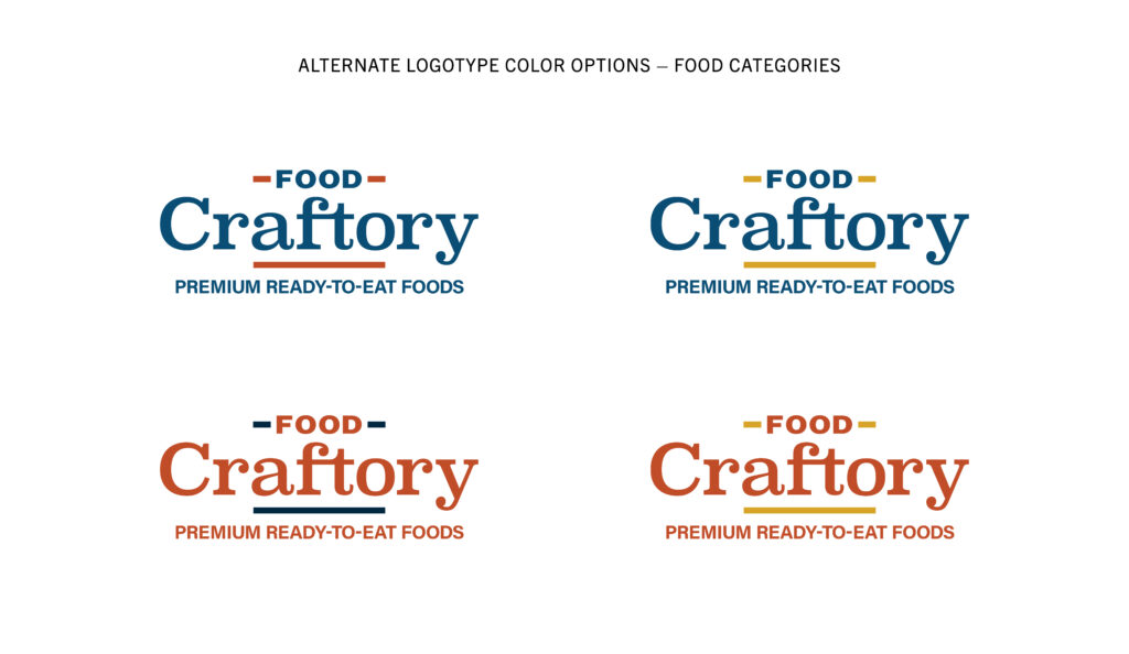
As a design team, we obsessed over the type because the word mark had to set the tone for the face of the company when they moved into their new digs. The nature of their business requires going to extremes for their clients, whether that is the environment in which the food must be created and maintained or the pace of fulfilling orders. We wanted to warm this space up, so we intentionally chose Superclarendon, an updated version of a timeless classic that is bold, friendly, and evocative of a time when printing was a craft.
Food Craftory
Big and small
The branding works on labels for sandwiches, on tubs for ready-to-eat and grab-and-go food packages, to a colossal LED back-lit sign with reverse white channel cut letters that glows for miles. The design was adeptly manufactured and installed by Lydell Toye and the experts at US Signs.
Branding Library